David Clinton
What Drives Canada’s Immigration Policies?
News release from The Audit

Government decisions have consequences. But they also have reasons.
Dearest readers: I would love to hear what you think about this topic. So please take the very brief survey at the end of the post.
Popular opposition to indiscriminate immigration has been significant and growing in many Western countries. Few in Canada deny our need for more skilled workers, and I think most of us are happy we’re providing a sanctuary for refugees escaping verifiable violence and oppression. We’re also likely united in our support for decent, hard working economic immigrants looking for better lives. But a half million new Canadians a year is widely seen as irresponsible.
So why did Canada, along with so many other Western governments, choose to ignore their own electorates and instead double down on ever-increasing immigration rates? Whatever nasty insults we might be tempted to hurl at elected officials and the civil servants who (sometimes) do their bidding, I try to remember that many of them are smart people honestly struggling to be effective. Governing isn’t easy. So it’s worth cutting through the rhetoric and trying to understand their policies on their own terms.
The Audit is a reader-supported publication. To receive new posts and support my work, consider becoming a free or paid subscriber.
As recently as 2022, the government – as part of its Annual Report to Parliament on Immigration – claimed that:
“Immigration is critical to Canada’s economic growth, and is key to supporting economic recovery”
There you have it. It’s at least officially about the economy. To be fair, the report also argued that immigration was necessary to address labor shortages, support an aging domestic population, and keep up with our “international commitments”. But economic considerations carried a lot of weight.
Now what I’d love to know is whether the “immigration-equals-better-
One possible way to measure economic health is by watching per capita gross domestic product (GDP) growth rates. Insofar as they represent anything real, the inflation-adjusted GDP rates themselves are interesting enough. But it’s the rates by which GDP grows or contracts that should really capture our attention.
The green line in the graph below represents Canada’s (first quarter) GDP growth rates from the past forty years. To be clear, when measured against, say, its 1984 value, the GDP itself has trended upwards fairly consistently. But looking at changes from one year to the next makes it easier to visualize more detailed historical fluctuations.
The blue bars in the chart represent each year’s immigration numbers as a percentage of the total Canadian population. That rate leapt above one percent of the population in 2021 – for the first time since the 1960’s – and hasn’t shown any signs of backing down. Put differently, Canada absorbed nearly 12 immigrants in 2023 for every 1,000 existing residents.
 |
Seeing both trends together in a single chart allows us to spot possible relationships. In particular, it seems that higher immigration rates (like the ones in 2018-2019 and 2022-2023) haven’t consistently sparked increases in the GDP.
With the exception of those COVID-crazed 2020 numbers – which are nutty outliers and are generally impossible to reliably incorporate into any narrative – there doesn’t ever seem to have been a correlation between higher immigration rates and significant GDP growth.
So, at best, there’s no indication that the fragile economy has benefited from that past decade’s immigration surge. As well-intentioned as it might have been, the experiment hasn’t been a success by any measure.
But it has come with some heavy social costs. The next chart shows the painful disconnect between an artificially rising population and a weak housing construction market. The blue bars, as before, represent immigration rates as a percentage of total population. This time, however, they go back all the way to 1961. The red line tells us about the number of single-detached housing starts per 1,000 people.
 |
With the exceptions of the mid-1960’s and the past few years, each of the historical immigration surges visible in the graph was either preceded or accompanied by appropriate home construction rates.
As an anomaly, the 1960’s surge was for obvious reasons far less damaging. Back then you could still purchase a nice three-bedroom house in what’s now considered midtown Toronto for no more than two years’ worth of an average salary. I know that, because that’s exactly when, where, and for how much my parents bought the house in which I spent most of my errant youth. Those elevated immigration levels didn’t lead us into economic crisis.
But what we’re witnessing right now is different. The housing supply necessary to affordably keep us all sheltered simply doesn’t exist. And, as I’ve already written, there’s no reason to imagine that that’ll change anytime over the next decade. (Can you spell “capital gains tax inclusion rate change”? I knew you could.)
Just to be complete, the disconnect doesn’t apply only to detached “built-to-own” houses. This next chart demonstrates that housing starts of all flavours – including rental units – grew appropriately in the context of historical immigration surges, but have clearly been dropping over the last couple of years.
 |
Since housing starts data isn’t the only tool for measuring the health of a housing market, here’s a visualization of rental apartment vacancy rates in Canada:
 |
The combination of a sluggish construction market and an immigration-fueled population explosion has been driving up prices and making life miserable for countless families. And things appear to be headed in the wrong direction.
So sure, immigration should play an important role in Canadian life. But by this point in the game, it’s pretty clear that recent government policy choices failed to reverse economic weakness and contributed to disastrous outcomes. Perhaps it’s time to change course.
Now it’s your turn. I hope you’ll take this very brief (and anonymous) survey.
Share your thoughts. Click to take the Immigration Policy survey.
Assuming we get enough responses, I’ll share the results later.
For the full experience, please subscribe to The Audit.


Based mostly on their 2024 budget, the federal government has promised $2.4 billion in support of artificial intelligence (A.I.) innovation and research. Given the potential importance of the A.I. sector and the universal expectation that modern governments should support private business development, this doesn’t sound all that crazy.
But does this particular implementation of that role actually make sense? After all, the global A.I. industry is currently suffering existential convulsions, with hundreds of billions of dollars worth of sector dominance regularly shifting back and forth between the big corporate players. And I’m not sure any major provider has yet built a demonstrably profitable model. Is Canada in a realistic position to compete on this playing field and, if we are, should we really want to?
First of all, it’s worth examining the planned spending itself.
- $2 billion over five years was committed to the Canadian Sovereign A.I. Compute Strategy, which targets public and private infrastructure for increasing A.I. compute capacity, including public supercomputing facilities.
- $200 million has been earmarked for the Regional Artificial Intelligence Initiative (RAII) via Regional Development Agencies intended to boost A.I. startups.
- $100 million to boost productivity is going to the National Research Council Canada’s A.I. Assist Program
- The Canadian A.I. Safety Institute will receive $50 million
In their goals, the $300 million going to those RAII and NRC programs don’t seem substantially different from existing industry support programs like SR&ED. So there’s really nothing much to say about them.
And I wish the poor folk at the Canadian A.I. Safety Institute the best of luck. Their goals might (or might not) be laudable, but I personally don’t see any chance they’ll be successful. Once A.I. models come on line, it’s only a matter of time before users will figure out how to make them do whatever they want.
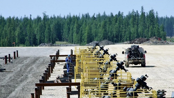
But I’m really interested in that $2 billion for infrastructure and compute capacity. The first red flag here has to be our access to sufficient power generation.
Canada currently generates more electrical power than we need, but that’s changing fast. To increase capacity to meet government EV mandates, decarbonization goals, and population growth could require doubling our capacity. And that’s before we try to bring A.I. super computers online. Just for context, Amazon, Microsoft, Google, and Oracle all have plans to build their own nuclear reactors to power their data centers. These things require an enormous amount of power.
I’m not sure I see a path to success here. Plowing money into A.I. compute infrastructure while promoting zero emissions policies that’ll ensure your infrastructure can never be powered isn’t smart.
However, the larger problem here may be the current state of the A.I. industry itself. All the frantic scrambling we’re seeing among investors and governments desperate to buy into the current gold rush is mostly focused on the astronomical investment returns that are possible.
There’s nothing wrong with that in principle. But “astronomical investment returns” are also possible by betting on extreme long shots at the race track or shorting equity positions in the Big Five Canadian banks. Not every “possible” investment is appropriate for government policymakers.
Right now the big players (OpenAI, Anthropic, etc.) are struggling to turn a profit. Sure, they regularly manage to build new models that drop the cost of an inference token by ten times. But those new models consume ten or a hundred times more tokens responding to each request. And flat-rate monthly customers regularly increase the volume and complexity of their requests. At this point, there’s apparently no easy way out of this trap.
Since business customers and power users – the most profitable parts of the market – insist on using only the newest and most powerful models while resisting pay-as-you-go contracts, profit margins aren’t scaling. Reportedly, OpenAI is betting on commoditizing its chat services and making its money from advertising. But it’s also working to drive Anthropic and the others out of business by competing head-to-head for the enterprise API business with low prices.
In other words, this is a highly volatile and competitive industry where it’s nearly impossible to visualize what success might even look like with confidence.
Is A.I. potentially world-changing? Yes it is. Could building A.I. compute infrastructure make some investors wildly wealthy? Yes it could. But is it the kind of gamble that’s suitable for public funds?
Perhaps not.

Rising CO2 levels have, in fact, been instrumental in promoting an ongoing planet-wide increase in vegetation cover. This is thanks to enhanced photosynthesis and water use efficiency and has contributed to higher agricultural yields. It turns out that, whatever acidification may be happening, there appears to be no serious impact on marine life.
The Climate Working Group at the U.S. Department of Energy recently published “A Critical Review of Impacts of Greenhouse Gas Emissions on the U.S. Climate“. Of note, that group includes University of Guelph’s very own Professor Ross McKitrick.
The authors conclude that while climate change is real and influenced by human emissions, its risks are often exaggerated. Instead:
- Published models have consistently and aggressively overestimated warming
- Extreme weather trends are not worsening as claimed
- Aggressive mitigation policies may cause more harm than good
Rising CO2 levels have, in fact, been instrumental in promoting an ongoing planet-wide increase in vegetation cover. This is thanks to enhanced photosynthesis and water use efficiency and has contributed to higher agricultural yields. It turns out that, whatever acidification may be happening, there appears to be no serious impact on marine life.
To be sure, there’s been vocal push back against the report’s findings. But that just highlights the complexity, volatility, and intense political stakes of the issues involved.
Despite my own stellar academic publishing history (see my high school paper from 45 years ago on CO2 emissions and the acidification of lakes in Ontario for full details), it turns out that I’m not qualified to express an opinion here. After all, I lack the necessary combined expertise in natural sciences, applied sciences, social sciences, and so on.
But I suspect that the people in Ottawa who make related policy decisions aren’t necessarily all that better prepared than I am. Which makes me wonder just how much of our money has been spent through the past ten years based on assumptions that are far from universally accepted in the scientific community.
The short answer is: many billions of dollars. Here are some highlights:
- $28.7 billion for the public transit envelope from the Investing in Canada Plan
- $26.9 billion for the Green Infrastructure Investments envelope from the Investing in Canada Plan
- $2 billion for the Low Carbon Economy Fund
- $8 billion for the Net Zero Accelerator
- $103 billion for the Clean-economy Investment Tax Credits (although that won’t all be spent before 2035)
- $3 billion in EV purchase rebates from the Incentives for Zero-Emission Vehicles
- $2.6 billion for Canada Greener Homes Grants
- $2.75 billion for the Zero-Emission Transit Fund (school buses and municipal ZEV fleets)
- $1.5 billion to support low-carbon fuel production and adoption
- $964 million for the Smart Renewables and Electrification Pathways Program (renewable projects, storage, and grid modernization)
- $680 million for Zero-Emission Vehicle Infrastructure Program (charging stations and hydrogen refuelling)
Granted, some of that funding will address other policy needs besides just climate change mitigation, and nearly all of it is designed to be paid out over multiple years. And of course, not all funds that were allocated have been spent yet. Two thumbs up for inertia!
But it’s still an awful lot of money considering no one really knows for sure whether any of this is helpful. Not to mention that, while it’s complicated, after a decade of trying, Canada’s actual emissions haven’t necessarily dropped.

Canada’s privacy commissioner says he was not consulted on bill to ban dissidents from internet

Enbridge CEO says ‘there’s a good reason’ for Alberta to champion new oil pipeline

Former Trump Advisor Says US Must Stop UN ‘Net Zero’ Climate Tax On American Ships

Long-Distance Field Goals Have Flipped The Field. Will The NFL Panic?

“Nation Building,” Liberal Style: We’re Fixing a Sewer, You’re Welcome, Canada

Poland’s president signs new zero income tax law for parents with two children

Democracy Watch Renews Push for Independent Prosecutor in SNC-Lavalin Case
-
 Business9 hours ago
Quebecers want feds to focus on illegal gun smuggling not gun confiscation
-
 Uncategorized1 day ago
New report warns WHO health rules erode Canada’s democracy and Charter rights
-
 Business9 hours ago
Emission regulations harm Canadians in exchange for no environmental benefit
-
 Energy1 day ago
Minus Forty and the Myth of Easy Energy
-
 Crime1 day ago
France stunned after thieves loot Louvre of Napoleon’s crown jewels
-
 Courageous Discourse7 hours ago
No Exit Wound – EITHER there was a very public “miracle” OR Charlie Kirk’s murder is not as it appears
-
 Frontier Centre for Public Policy2 days ago
Ottawa Should Think Twice Before Taxing Churches
-
 Alberta2 days ago
Busting five myths about the Alberta oil sands